
Table of Contents
The Best Monitors for Content Creators: Color Accuracy Breakdown
Why Color Accuracy Matters for Creators
If you’re a photographer, video editor, graphic designer, or digital artist, you know that color accuracy is more than just a spec—it’s the difference between professional-grade work and amateur results. A monitor that can reproduce colors precisely ensures your edits translate perfectly to print, web, or video, eliminating the frustration of what designers call “screen-to-print mismatch.”
Imagine spending hours perfecting a vibrant sunset photograph on your monitor, only to have the client receive prints that look washed out and lifeless. Or consider the video editor who meticulously grades footage to match a cinematic color palette, only to discover the final export looks completely different on their client’s devices. These scenarios happen more often than you’d think, and they all stem from one critical issue: inaccurate color reproduction on the creator’s display.
The challenge is that not all monitors are built the same. Some prioritize gaming speed with high refresh rates, while others focus on budget pricing that sacrifices color fidelity. Mainstream consumer displays often boost saturation artificially to make content appear more vivid and appealing in stores, but this comes at the cost of accuracy. For content creators whose livelihoods depend on precise color representation, this simply won’t do.
Professional-grade monitors designed for content creation undergo rigorous factory calibration to ensure what you see on screen matches industry color standards. They support wider color gamuts, maintain consistency across the entire screen surface, and provide the tools necessary for ongoing calibration as the display ages. The initial investment in a color-accurate monitor pays dividends through reduced revisions, satisfied clients, and the confidence that your creative vision translates accurately across all viewing platforms.
In this comprehensive guide, we’ll help you choose the best monitors for content creators, with a deep dive into color accuracy metrics, panel technologies, and coverage of essential color spaces like sRGB, AdobeRGB, and DCI-P3. Whether you’re just starting your creative journey or upgrading your professional workflow, understanding these fundamentals will transform how you evaluate and select your next display.
What Makes a Monitor Great for Content Creation?
Selecting the right monitor for creative work requires understanding several interconnected specifications that work together to deliver accurate, reliable color reproduction. When shopping for a creator-focused monitor, look for these essential features:

Color Accuracy (Delta E)
Delta E (ΔE) measures the difference between a displayed color and the reference standard—essentially, it quantifies color error. The lower the Delta E value, the more accurate the color reproduction. For professional color work, look for a ΔE < 2, which is the threshold where color differences become virtually imperceptible to the human eye. High-end professional monitors often achieve ΔE < 1, while consumer displays typically fall between 3-5 or higher.
This metric matters because even small color deviations compound across an entire image or video sequence. A monitor with ΔE of 4 might seem acceptable in isolation, but those inaccuracies affect every color decision you make during the editing process.
Color Gamut Support
Color gamut refers to the range of colors a monitor can display. Different industries rely on different color space standards:
sRGB (Standard RGB) is the baseline color space for web content, digital displays, and general-purpose work. Virtually all modern content is created with sRGB in mind, making 99-100% sRGB coverage essential for any creator monitor. This color space was developed in 1996 and remains the standard for web browsers, operating systems, and most consumer displays.
AdobeRGB encompasses a wider range of colors than sRGB, particularly in cyan-green tones. This expanded gamut is crucial for print media and photography, as modern printers can reproduce colors outside the sRGB spectrum. Professional photographers working with high-quality prints should prioritize monitors with 90-100% AdobeRGB coverage to ensure their edited images translate accurately to physical media.
DCI-P3 was originally developed for digital cinema projection and has become the standard for video editing and HDR content. With approximately 25% more colors than sRGB, particularly in reds and greens, DCI-P3 coverage of 90%+ is ideal for video editors working with modern camera footage and preparing content for theatrical display, streaming platforms, or HDR workflows.
Resolution and Pixel Density
While 1440p (2560×1440) provides adequate detail for most creative work, 4K resolution (3840×2160) has become the preferred standard for content creators who demand precise editing capabilities. The increased pixel density allows you to work with fine details without constantly zooming in and out, view more of your timeline or layers panel simultaneously, and better evaluate actual image sharpness and detail.
For those working with exceptionally high-resolution photography or specialized applications, 5K displays offer even greater precision, though the benefits diminish beyond this point for most creative workflows.
Panel Technology
IPS (In-Plane Switching) panels dominate the creator monitor market due to their wide viewing angles (typically 178 degrees) that maintain color accuracy even when viewed off-center, superior color reproduction compared to TN or VA panels, and consistent performance across the screen surface without color shifting.
OLED panels are emerging as premium options for video editors, offering perfect blacks with infinite contrast ratios, exceptional color accuracy, and instantaneous pixel response times. However, OLED displays require consideration of potential burn-in with static UI elements during extended use.
Factory Calibration
Premium content creation monitors typically arrive pre-calibrated from the factory, with calibration reports documenting the specific color accuracy achieved for your individual unit. This factory calibration saves time and ensures baseline accuracy immediately upon setup. Some high-end models include built-in hardware calibration sensors that maintain accuracy automatically over the display’s lifespan.
Look for monitors that include calibration certificates showing Delta E values for grayscale, color accuracy across the entire gamut, and gamma curve precision. This documentation provides verifiable proof of the display’s capabilities rather than relying solely on manufacturer claims.
Connectivity and Features
Modern creative workflows benefit from USB-C connectivity with power delivery, allowing a single cable to handle video, data transfer, and laptop charging simultaneously. Built-in USB hubs, SDCard readers, and KVM switching capabilities further streamline workspace organization. For video editors, 10-bit color support (displaying over one billion colors compared to the 16.7 million of 8-bit panels) provides smoother gradients and reduces color banding in subtle tonal transitions.
Top Monitors for Content Creators (2025 Picks)
1. ASUS ProArt Display PA32UCR-K – Best Overall for Professionals
The ASUS ProArt PA32UCR-K represents the pinnacle of professional content creation displays, combining exceptional technical specifications with practical workflow features that justify its premium positioning.
Panel Technology: This 32-inch 4K IPS display provides ample screen real estate for complex editing workflows while maintaining a pixel density of 138 PPI that keeps individual pixels invisible at normal viewing distances. The IPS panel delivers rock-solid viewing angles, ensuring color consistency whether you’re viewing content straight-on or sharing your work with clients standing beside you.
Color Gamut Excellence: With coverage of 99% AdobeRGB, 99% DCI-P3, and 100% sRGB, this monitor essentially covers every color space that matters for professional creative work. Photographers benefit from the extensive AdobeRGB coverage when preparing images for print, while video editors appreciate the comprehensive DCI-P3 support for modern cinema and HDR workflows. The ability to switch between color space emulation modes ensures accurate preview regardless of your target output medium.
Factory Calibration and Delta E: Each PA32UCR-K undergoes rigorous factory calibration to achieve Delta E < 2 out of the box, with individual calibration reports included for verification. More impressively, ASUS includes a built-in motorized colorimeter that automatically performs hardware calibration without requiring external equipment. This integrated sensor can be scheduled to recalibrate the display monthly, ensuring consistent accuracy as the panel ages.

- 32-inch 4K HDR display features mini-LED backlight with 1,000 cd/m2 peak brightness
- Quantum-dot technology provides 99.5% Adobe RGB, 98% DCI-P3 and 100% sRGB color space for exceptional color fidelity
- Support multiple HDR formats (HDR-10, HLG) presents lifelike experience and flexibility
- World-leading delta-E (∆E) <1 color difference value and ASUS ProArt Hardware Calibration technology for color-accuracy optimization, uniformity and color profile write-back
- 3-month Adobe Creative Cloud: Receive complimentary access with the purchase of this product (valid until 8/31/2026)
HDR Capabilities: The DisplayHDR 1000 certification indicates this monitor achieves 1000 nits peak brightness in HDR content—far exceeding the minimum requirements for serious HDR grading work. This level of brightness capability, combined with sophisticated local dimming, allows creators to accurately evaluate HDR content as it will appear on consumer TVs and streaming platforms.
Professional Features: The PA32UCR-K includes ASUS’s ProArt Calibration Technology, which allows remote calibration and monitoring across multiple displays—invaluable for studios maintaining color consistency across workstations. The monitor provides preset modes optimized for different workflows (photography, video editing, CAD/CAM, etc.), though most professionals will create custom calibrated modes for their specific needs.
Connectivity: Comprehensive port selection includes DisplayPort 1.4, HDMI 2.0, USB-C with 96W power delivery, and a built-in USB hub. The USB-C connection alone can drive the display while simultaneously charging a laptop and providing data connectivity—a genuinely single-cable solution.
Who It’s For: This monitor justifies its investment for professional photographers preparing work for print publication, video colorists working in HDR workflows, and design studios requiring absolute color consistency across projects. The built-in calibration sensor alone saves hundreds of dollars in external calibration equipment while ensuring ongoing accuracy.
2. Apple Studio Display – Best for Mac Users
The Apple Studio Display targets creative professionals deeply embedded in the Apple ecosystem, offering seamless integration with macOS and exceptional image quality that leverages Apple’s display expertise developed through years of creating industry-leading laptop and desktop screens.
5K Retina Display: The 27-inch panel delivers an impressive 5120×2880 resolution, providing 218 pixels per inch—making individual pixels completely imperceptible at normal viewing distances. This pixel density exceeds 4K displays of similar size, offering exceptional sharpness for evaluating fine image details, reading small text in professional applications, and working with high-resolution photography without scaling compromises.
P3 Wide Color Gamut: Apple calibrates the Studio Display to cover the DCI-P3 color space, aligning perfectly with modern video workflows and the native color space of contemporary iPhone and iPad cameras. For creators working primarily within the Apple ecosystem—shooting on iPhone, editing in Final Cut Pro, and delivering to Apple devices—this display provides an accurate preview of how content will appear across the entire workflow.
True Tone Technology: While controversial among some purists, True Tone uses ambient light sensors to adjust the display’s white point to match surrounding lighting conditions. This reduces eye strain during extended editing sessions and can be disabled when absolute color accuracy takes priority over viewing comfort. For creative professionals, the ability to toggle this feature provides flexibility between “comfortable all-day viewing” and “critical color evaluation” modes.

- Immersive 27-inch 5K Retina display with 600 nits of brightness, support for one billion colors, and P3 wide color*
- 12MP Ultra Wide camera with Center Stage for more engaging video calls
- Studio-quality three-mic array for crystal-clear calls and voice recordings
- Six-speaker sound system with Spatial Audio for an unbelievable listening experience
- One Thunderbolt 3 port, three USB-C ports
Integrated Ecosystem: The Studio Display includes a surprisingly capable six-speaker sound system with spatial audio support, a studio-quality microphone array for video calls, and a 12MP ultrawide camera with Center Stage for video conferencing. While these features might seem tangential to creative work, they eliminate the need for additional peripherals and streamline workspace organization.
Thunderbolt Connectivity: A single Thunderbolt cable provides video, data, and up to 96W of power delivery to connected MacBooks. Three additional USB-C ports on the display function as a hub for peripherals, storage, and accessories. This clean connectivity solution aligns with Apple’s minimalist design philosophy while providing practical functionality.
macOS Integration: The Studio Display works as a seamless extension of macOS, with automatic color management, perfect scaling support, and coordination with system-level features like Night Shift and reference modes. For professionals using Final Cut Pro, Motion, or Logic Pro, the display’s color characteristics match Apple’s professional application ecosystem exactly.
Limitations to Consider: The Studio Display lacks adjustable color gamut modes—it displays P3 or can be software-limited to sRGB, but doesn’t support AdobeRGB workflows critical for print photography. The fixed stand (adjustable stands cost extra) and limited ergonomic adjustment may require additional mounting solutions for optimal positioning.
Who It’s For: Video editors working in Final Cut Pro, content creators producing primarily for Apple platforms and social media, and design professionals who prioritize the convenience of ecosystem integration over ultimate color gamut flexibility will find the Studio Display delivers exceptional value within its target use case.
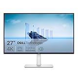
3. Dell UltraSharp U2723QE – Best 4K Monitor for Creators on a Budget
The Dell UltraSharp U2723QE demonstrates that professional-grade color accuracy doesn’t require four-figure investments, making it an ideal entry point for emerging content creators or as a secondary display for established professionals.
4K IPS Panel: The 27-inch screen with 3840×2160 resolution strikes an optimal balance between screen real estate and pixel density. At 163 PPI, text remains crisp and images appear sharp without requiring macOS or Windows scaling, which can complicate some professional workflows. The IPS panel ensures color consistency across wide viewing angles—essential when collaborating with clients or colleagues.
Color Accuracy: Dell factory-calibrates each U2723QE to achieve 100% sRGB and 98% DCI-P3 coverage with Delta E typically under 2 for most units. This color performance rivals monitors costing significantly more, making it genuinely competitive for professional color work. The comprehensive DCI-P3 coverage particularly benefits video editors working with modern camera footage and preparing content for streaming platforms.
USB-C Hub Functionality: The integrated USB-C connection provides 90W power delivery—sufficient to charge most laptops while simultaneously transmitting video and data. Additional USB-A and USB-C downstream ports transform the display into a full-featured docking station, eliminating cable clutter and simplifying daily setup/teardown for laptop users.
ComfortView Plus: Dell’s flicker-free backlighting with hardware-based low blue light reduction reduces eye strain during extended editing sessions without the color shift associated with software-based blue light filters. This feature can be toggled as needed, allowing comfortable all-day use without compromising color accuracy during critical evaluation.
- 16:9 widescreen resolution perfect for watching movies, playing video games and getting on with office work. Screen Coating : Anti-glare, 3H Hard Coating. Pixel Pitch : 0.1554 mm. Pixel Per Inch : 163.18.Specific uses for product – Gaming, Desktop
- Enjoy crisp content and energetic hues with the 400 Nit brightness
- Features HDMI input to get connected with the top of the line PCs, Blu-ray players, and cutting edge gaming consoles
- 5 ms GTG (Fast) response time makes it excellent for latest action films, sports or gaming
- Resolution / Refresh Rate: 4K 3840 x 2160 at 60 Hz
Connectivity Options: Beyond USB-C, the monitor includes DisplayPort 1.4, HDMI 2.0, and Ethernet pass-through via the USB-C connection. This diverse connectivity supports virtually any laptop or desktop configuration, from MacBooks to Windows workstations to Linux editing systems.
Value Proposition: At typically half the cost of premium professional displays, the U2723QE delivers approximately 90% of the color accuracy for a fraction of the price. The trade-offs—slightly narrower AdobeRGB coverage, no built-in calibration sensor, and less sophisticated HDR support—won’t impact most digital-first workflows focused on web, social media, or streaming content.
Calibration Considerations: While factory calibration provides excellent baseline accuracy, serious professionals should plan to perform software calibration with a colorimeter (like the X-Rite i1Display Pro or Datacolor SpyderX) to achieve optimal results and compensate for panel variance and drift over time.
Who It’s For: Budget-conscious content creators focusing primarily on digital delivery, secondary displays for multi-monitor setups, remote work setups requiring a portable USB-C solution, and students or emerging professionals building their first color-managed workflow will find this display offers professional capabilities at accessible pricing.
4. Eizo ColorEdge CS2740 – Best for Print and Photo Editing
Eizo has built its reputation on uncompromising color accuracy for professional imaging applications, and the ColorEdge CS2740 continues this tradition with features specifically tailored to photographers preparing work for print publication.
27-Inch 4K IPS Panel: The display delivers exceptional uniformity across the entire screen surface, with Eizo’s Digital Uniformity Equalizer (DUE) technology compensating for the slight brightness and color variations that occur naturally in LCD panels. This ensures consistent color representation whether you’re editing details in the center of the screen or evaluating corners of your composition.
AdobeRGB Coverage: With 99% AdobeRGB gamut coverage, the CS2740 reproduces the extended color range that modern photo printers can output. This is particularly crucial for landscape and nature photographers working with vibrant greens and cyans that fall outside the sRGB color space. What you see on screen will accurately predict how your prints will appear when output on professional photo printers using wide-gamut inks.
Built-In Hardware Calibration: Unlike software calibration that adjusts the video card output (potentially reducing tonal steps), Eizo’s hardware calibration directly modifies the display’s internal lookup tables. This provides more precise color control and preserves the full tonal range from shadows to highlights. The included ColorNavigator software guides users through calibration with supported colorimeters, creating custom ICC profiles optimized for specific viewing conditions and paper types.
Self-Calibration Sensor: High-end ColorEdge models include a built-in calibration sensor that swings out to perform automatic calibration on a schedule you define (monthly calibration is typically recommended). This eliminates the hassle of manual recalibration and ensures consistent accuracy as the display ages—LCD panels naturally shift color characteristics over their lifespan, and regular calibration compensates for this drift.
SelfCorrection and CMYK Simulation: The CS2740 can simulate how images will appear when printed using different paper types and printer profiles, allowing photographers to evaluate print output without costly test prints. The display can also switch between color modes instantly, showing how an image will appear in sRGB for web use versus AdobeRGB for print.
- Improved ComfortView Plus: Reduces harmful blue light emissions to ≤35%, for all-day comfort without sacrificing color accuracy.
- Refresh rate: A smooth, tear-free experience with AMD FreeSync Premium (refresh rate up to 120Hz) and an ultra-low 0.03ms response time create a captivating experience for work and play.
- Vivid colors: Immerse yourself in breathtaking 4K visuals with in-plane switching technology. Enjoy vibrant colors with 99% sRGB. The 1500:1 contrast ratio and HDR readiness deliver excellent depth and detail.
- Re-engineered sound quality: Enjoy more detailed sound with spacious audio featuring greater output power, deeper frequency response and more decibel range than the previous generation.
- Ultra-thin bezel: Designed with a sleek, modern aesthetic and an ash white finish, this display features ultra-thin bezels for a refined, minimalist design.
Professional Build Quality: Eizo monitors are engineered for professional environments with industrial-grade components designed for extended operational life. The backlight is specified to maintain at least 10,000 hours before degrading to 50% of initial brightness—roughly five years of full-time professional use. Additionally, Eizo provides a five-year manufacturer’s warranty covering the panel, backlight, and all components.
Limitations: The CS2740’s focus on accuracy means it doesn’t pursue the high brightness levels necessary for serious HDR grading work. Additionally, the DCI-P3 coverage (approximately 96%) trails video-focused displays, though it remains adequate for most photography workflows.
Who It’s For: Professional photographers preparing work for gallery exhibition or commercial print publication, studios requiring absolute color consistency between capture and output, and fine art photographers who demand the highest possible fidelity will find the CS2740’s precision and reliability justify the investment.
5. LG UltraFine 32UQ85R – Best HDR Monitor for Creators
The LG UltraFine 32UQ85R specifically targets video editors and motion graphics artists working with HDR (High Dynamic Range) content, balancing professional color accuracy with the expanded brightness and contrast range demanded by modern video workflows.
32-Inch 4K IPS Panel: The larger screen size provides more workspace for complex timelines, multiple windows, and detailed footage evaluation. At 4K resolution, the 138 PPI pixel density maintains sharp image quality while the increased real estate reduces constant window rearrangement.
DCI-P3 Color Gamut: With 95% DCI-P3 coverage, the 32UQ85R accurately reproduces the wide color gamut captured by modern cinema cameras and expected by streaming platforms like Netflix, Apple TV+, and Disney+. This coverage ensures that color grading decisions made on the display will translate accurately to final delivery, whether that’s theatrical projection, streaming HDR, or standard dynamic range distribution.
DisplayHDR 400 True Black Certification: This certification indicates the display meets VESA’s standards for HDR performance, including peak brightness of 400 nits in HDR mode, support for 10-bit color depth (over one billion colors), and wide color gamut support. The “True Black” designation specifically indicates superior black level performance compared to standard DisplayHDR 400 displays—crucial for evaluating shadow detail in HDR footage.
Nano IPS Technology: LG’s Nano IPS uses nanoparticles applied to the LED backlight to filter and refine the wavelengths of light reaching the panel. This technology expands color gamut coverage while improving color purity—reducing the slight color contamination that occurs in standard IPS panels and resulting in more accurate, vibrant color reproduction.
HDR Workflow Support: The monitor supports both HDR10 and HLG (Hybrid Log-Gamma) standards, covering the primary HDR formats used in professional video production. Editors can switch between SDR and HDR viewing modes to evaluate how content will appear across different distribution channels—critical since most viewers still consume content on SDR displays.

- Stunning Image Quality in 4K Display – The 27-inch UHD 4K (3840 x 2160) display reproduces clear images and vibrant colors with up to 95% DCI-P3 color gamut expression . Experience dramatic visual immersion with all your favorite shows, movies, sports and games.
- 4K UHD HDR – To more fully realize content creators vision, this monitor is compatible with VESA DisplayHDR 400 high dynamic range, supporting specific levels of color and brightness that exceed the capabilities of ordinary monitors.
- Color Your World – Explore HDR content the way it was meant to be seen with up to 95% DCI-P3 color gamut expression—an elevated color spectrum that brings brilliant color to life.
- Put More Ports to Work – Enjoy more ways to connect. LG UltraFine Monitor offers USB Type-C for data transfer and power delivery up to 90W, as well as DisplayPort, two HDMI connections, two USB 3.0 ports and headphone jack. Forget the adapters and dongles.
- Stereo Speaker with Waves MaxxAudio – Make some noise with built-in stereo speakers equipped with Waves MaxxAudio, and make your games and movies come to life with bigger and bolder sound.
USB-C Connectivity: A single USB-C cable handles video transmission, data transfer, and 90W laptop charging. This simplified connectivity particularly benefits laptop-based editors who can dock their MacBook Pro or Windows workstation with a single cable while maintaining full 4K@60Hz bandwidth.
Calibration and Accuracy: LG factory-calibrates these displays for color accuracy, though individual unit variation exists. For professional work, software calibration with a hardware colorimeter remains recommended to achieve optimal results. The display supports both sRGB and DCI-P3 color space emulation, allowing accurate preview regardless of target delivery platform.
Value for HDR Workflows: While the DisplayHDR 400 specification doesn’t match the 1000+ nit peak brightness of top-tier HDR grading monitors, the 32UQ85R provides sufficient dynamic range for most editorial workflows at a fraction of professional reference monitor costs. Colorists preparing content for theatrical release will still require higher-grade displays, but editors working on streaming content, YouTube, or broadcast will find this display more than adequate.
Who It’s For: Video editors working with modern camera formats (RED, ARRI, Sony, etc.) that capture wide color gamut footage, YouTubers and content creators optimizing for HDR delivery on platforms like YouTube and Vimeo, and motion graphics artists working in applications like Adobe After Effects or DaVinci Resolve will appreciate the combination of color accuracy and HDR preview capabilities.
6. BenQ PD3220U – Best for Designers and 3D Artists
The BenQ PD3220U distinguishes itself through specialized display modes tailored to specific creative disciplines, making it particularly valuable for designers who work across multiple applications with different visual requirements.
32-Inch 4K IPS Display: The expansive 32-inch screen provides substantial workspace for complex CAD drawings, detailed 3D models, and design applications with extensive tool palettes. The 4K resolution ensures technical drawings remain sharp with clearly defined lines and text, while the IPS panel maintains color accuracy across wide viewing angles.
Comprehensive Color Gamut: The PD3220U covers 95% DCI-P3 and 100% sRGB, providing flexibility for designers working across both print and digital media. While the AdobeRGB coverage (approximately 85%) trails photography-focused displays, it remains adequate for most design workflows where web and screen delivery predominate.
Specialized Display Modes: BenQ’s advanced mode switching sets this monitor apart with pre-calibrated settings for specific creative disciplines. CAD/CAM mode enhances line contrast and clarity for technical drawings, making fine details and dimensions more visible. Animation mode optimizes color and contrast for frame-by-frame work while reducing eye strain during extended sessions. Darkroom mode simulates developing room conditions for photographers evaluating black and white images, providing a reference for traditional photographic processes.

- DEEP BLACK IPS PANEL w 2000:1 CONTRAST RATIO: Enjoy unrivaled depth and contrast with the 2000:1 IPS Black Technology
- MADE for Mac DESIGNERS: 32″ 4K monitor features Pantone Validated and Calman verified color accurate technology. Built with M-Book mode which features Mac compatible color matching. Experience 98% P3 and 100% sRGB color coverage with Delta E ≤ 2
- DISPLAY PILOT 2 & HOTKEY PUCK: Sleek display management and easy brightness control right from your Mac. Easy input switching and auto pivot plus simple desktop partitioning.
- 40Gb/s BANDWIDTH THUNDERBOLT 3: Synchronizes images, videos, data and charge all of your Mac devices with an all-in-one cable! Free up your desk space and say goodbye to clutter thanks to the daisy-chain connectivity capabilities! Seamlessly connect your computer/laptop to create a multi-monitor setup.
- ERGONOMIC & SLEEK DESIGN : An anodized metal base and stand that look great and allow you to fine-tune screen positioning with tilt, swivel, pivot, and height adjustment. Find the perfect combination for your workspace and enjoy superior comfort to support your creativity and productivity
AQCOLOR Technology: BenQ’s AQCOLOR certification guarantees factory calibration to professional standards with verified Delta E < 3 color accuracy, industry-standard gamma curves (typically gamma 2.2), and comprehensive color space coverage. Each monitor includes a detailed calibration report documenting its specific performance characteristics.
Thunderbolt 3 Connectivity: The inclusion of Thunderbolt 3 provides 40 Gbps bandwidth for 4K@60Hz video transmission along with 85W power delivery and daisy-chain capability for additional displays or peripherals. For designers working with external storage, the Thunderbolt connection enables simultaneous high-speed data transfer while driving the display—particularly valuable when working with large design files or rendering projects.
Hotkey Puck G2: BenQ includes a wired control puck that provides quick access to display modes, brightness adjustments, and color settings without navigating on-screen menus. Designers can program custom shortcuts for frequently-used combinations, streamlining workflow transitions between different applications or project phases.
Ergonomic Design: The display offers comprehensive adjustment including height, tilt, swivel, and pivot to portrait orientation. The ability to rotate to portrait mode particularly benefits graphic designers working with vertical layouts, magazine spreads, or web design mockups.
Eye Care Technology: BenQ incorporates flicker-free backlighting, low blue light modes (that can be adjusted without significantly impacting color accuracy), and brightness intelligence technology that automatically adjusts screen brightness based on ambient lighting conditions. These features reduce eye fatigue during extended design sessions while maintaining the color accuracy necessary for professional work.
Who It’s For: Industrial designers working in CAD applications (SolidWorks, AutoCAD, Fusion 360), 3D artists and animators using Blender, Cinema 4D, or Maya, graphic designers who need flexibility to switch between different visual requirements throughout the day, and creative professionals seeking a single display that adapts to multiple workflows rather than requiring separate monitors for different tasks.
Color Spaces Explained: What Creators Should Know
Understanding color spaces is fundamental to achieving accurate color reproduction in creative work. Each color space defines a specific range of reproducible colors, and matching your monitor’s capabilities to your workflow requirements ensures what you create matches your intended output.
sRGB: The Universal Standard
sRGB (Standard Red Green Blue) was developed jointly by HP and Microsoft in 1996 as a standardized color space for monitors, printers, and the internet. It has become the de facto standard for virtually all web content, digital cameras in automatic mode, and consumer displays.
Coverage Requirements: For any creative work, your monitor should display at minimum 99-100% of the sRGB color space. Anything less means you cannot accurately represent colors that exist within this fundamental standard, leading to potential color mismatches when content is viewed on other devices.
Best For: Web designers, UI/UX designers, social media content creators, digital illustrators publishing online, and any creative professional whose final output will primarily be viewed on consumer displays (laptops, phones, tablets) or published to the web.
Workflow Considerations: Most operating systems, web browsers, and applications assume sRGB by default unless specifically configured otherwise. This makes it the “safe” color space for ensuring consistent appearance across the widest range of viewing devices, though it represents the smallest color gamut of the three major spaces discussed here.
AdobeRGB: The Print Professional’s Choice
AdobeRGB was developed by Adobe Systems in 1998 specifically to encompass most of the colors achievable on CMYK color printers. The color space is approximately 35% larger than sRGB, with significant expansion in cyan-green tones that appear in nature photography, landscapes, and product photography.
Coverage Requirements: Professional photographers preparing work for print should target 90-100% AdobeRGB coverage. Coverage below 90% means losing access to printable colors, potentially resulting in unexpected color shifts when images are sent to professional photo labs or offset printers.
Best For: Professional photographers preparing work for gallery exhibition, magazine publication, or commercial printing; fine art reproduction; product photography where accurate color matching to physical samples is critical; and prepress professionals preparing files for offset printing.
Workflow Considerations: Working in AdobeRGB requires proper color management throughout your entire workflow. Images must be captured in AdobeRGB (most professional cameras support this), edited in color-managed applications like Adobe Photoshop or Lightroom, and converted appropriately for final output. Failing to properly convert AdobeRGB images to sRGB for web use results in washed-out, desaturated appearance on most displays.
DCI-P3: The Cinema and HDR Standard
DCI-P3 (Digital Cinema Initiatives – Protocol 3) was originally developed for digital cinema projection systems and has been adopted as the standard for HDR content, modern mobile devices (iPhone displays support P3), and professional video workflows. P3 encompasses approximately 25% more colors than sRGB, with particular strength in red and green tones.
Coverage Requirements: Video editors and colorists working with modern camera formats or HDR delivery should seek 90%+ DCI-P3 coverage. This ensures accurate preview of how footage will appear in theatrical presentation, on modern HDR televisions, or when viewed on contemporary smartphones and tablets.
Best For: Video editors working with RED, ARRI, Sony cinema cameras; colorists grading content for streaming platforms (Netflix, Apple TV+, Disney+); motion graphics artists creating content for cinema or HDR display; and content creators optimizing videos for viewing on modern mobile devices.
Workflow Considerations: DCI-P3 has become increasingly important as HDR workflows expand beyond cinema into streaming and broadcast. Most modern NLEs (Non-Linear Editors) like DaVinci Resolve, Premiere Pro, and Final Cut Pro support P3 color management, allowing proper handling of wide gamut footage from capture through final delivery.
Delta E: Measuring Color Accuracy
Delta E (ΔE) quantifies the difference between a displayed color and the reference standard—essentially measuring color error. The metric uses complex mathematical modeling of human color perception to provide meaningful accuracy measurements.
Interpretation Scale:
- ΔE < 1: Imperceptible difference; exceptional accuracy
- ΔE 1-2: Perceptible only to trained eyes; professional standard
- ΔE 2-3: Noticeable to experienced users; acceptable for most work
- ΔE 3-5: Obvious color deviation; unsuitable for color-critical work
- ΔE > 5: Significant color error; unacceptable for professional use
What to Look For: Professional content creation demands Delta E < 2 as the benchmark for color-critical tasks. Many premium monitors achieve Delta E < 1 after calibration, while consumer displays often fall between 3-5 or higher even after attempted calibration.
Testing Considerations: Delta E specifications are meaningful only when accompanied by calibration reports showing measurement methodology, test patch count, and which color space was evaluated. Marketing claims of “average Delta E < 2” can hide significant errors in specific colors if only a limited test set was used.
Tips for Getting the Most Out of Your Color-Accurate Monitor
Owning a professional-grade display represents only the first step in achieving accurate color reproduction. Proper setup, ongoing maintenance, and optimal viewing conditions ensure you realize the full potential of your investment.
Regular Monitor Calibration
Even the most expensive, factory-calibrated monitors drift over time as their backlights age and panel characteristics shift. Hardware calibration using devices like the X-Rite i1Display Pro, Datacolor SpyderX Elite, or ColorMunki ensures ongoing accuracy throughout your display’s lifespan.
Calibration Frequency: Professional colorists working in commercial environments typically calibrate weekly or biweekly. For most content creators, monthly calibration strikes a reasonable balance between maintaining accuracy and avoiding excessive workflow interruption. At minimum, recalibrate quarterly and whenever you notice color shifts.
Calibration Targets: When configuring your calibration software, set appropriate targets for your specific workflow. Standard targets include white point of D65 (6500K) matching daylight viewing conditions, gamma 2.2 for video work or gamma 2.4 for print workflows, and luminance of 120 cd/m² for general work or 100 cd/m² for print matching.
Multiple Profiles: Consider creating multiple calibration profiles optimized for different workflows. A photographer might maintain profiles for AdobeRGB print work, sRGB web optimization, and an evening profile with reduced blue light for comfortable late-night editing.
Control Your Viewing Environment
The environment surrounding your monitor significantly impacts color perception. Professional color grading suites and photo retouching studios maintain strict lighting control for good reason—ambient light affects how your eyes perceive color and contrast on screen.
Ambient Light Consistency: Ideally, work in controlled lighting that remains consistent throughout the day. Dramatic changes in ambient light—from morning sunlight to afternoon shadows to evening artificial lighting—cause your eyes to constantly adapt, making consistent color evaluation difficult. If natural lighting cannot be controlled, consider neutral gray blackout curtains or blinds.
Light Temperature Matters: The color temperature of ambient lighting influences color perception. Professional environments typically use D50 (5000K) lighting for print evaluation or D65 (6500K) for video work. Consumer LED bulbs marked “daylight” or “cool white” approximate these temperatures, while “warm white” bulbs introduce yellow casts that affect color judgment.
Reduce Glare and Reflections: Position your monitor perpendicular to windows to minimize reflections and glare on the screen surface. Matte finish screens reduce reflections compared to glossy displays, though glossy panels often provide superior contrast and color saturation. Some creators invest in monitor hoods—collapsible fabric enclosures that shield the screen from ambient light and reflections entirely.
Wall and Desk Colors: Surprisingly, your workspace colors impact color perception through reflected light. Professional color grading bays use neutral gray walls (approximately 50% gray) to avoid color contamination. While repainting your workspace gray may be impractical, avoiding brightly colored walls directly behind or beside your monitor helps maintain neutral viewing conditions.
Proper Color Space Management
Understanding and implementing correct color space workflows ensures your careful color work translates accurately to final output, whether that’s print, web, video, or mixed media.
Application Settings: Configure your creative applications to use appropriate color spaces. Adobe Photoshop, for example, should have color settings configured to match your monitor profile and intended output. Video editing applications like DaVinci Resolve or Premiere Pro include color management settings that match your display capabilities and timeline color space to delivery requirements.
Monitor Profiles: Ensure your operating system uses the correct ICC profile generated during monitor calibration. macOS and Windows both include color management systems that reference these profiles, but they must be properly configured and activated. The calibration software typically handles this automatically, but verification prevents common configuration errors.
Color Space Conversions: When preparing content for different outputs, perform explicit color space conversions rather than relying on automatic handling. Converting an AdobeRGB photograph to sRGB for web use requires intentional conversion with rendering intent appropriate for your content (usually perceptual or relative colorimetric).
Soft Proofing: Use soft proofing features in applications like Photoshop or Lightroom to preview how your images will appear when printed or displayed in different color spaces. This eliminates surprises when final output doesn’t match your screen preview, allowing proactive adjustment before costly printing or final delivery.
Consider Reference Monitors for Critical Work
While the monitors discussed in this guide serve professional content creation extremely well, truly critical color grading work—particularly cinema, broadcast, or commercial advertising—may warrant investing in dedicated reference monitors from manufacturers like Sony, Canon, or Flanders Scientific.
Reference Monitor Characteristics: Professional reference monitors maintain color accuracy to even tighter tolerances (often ΔE < 0.5), support sophisticated HDR workflows including ST.2084 (PQ) and HLG transfer functions, include waveform monitors and vectorscopes for technical evaluation, and undergo regular professional calibration and certification.
When to Consider: If your work regularly appears in theatrical release, national broadcast, or high-end commercial advertising where absolute color accuracy directly impacts revenue, reference monitors become business necessities rather than luxury purchases. For most content creators, the prosumer displays featured in this guide provide excellent color accuracy for a fraction of reference monitor costs.
Display Warm-Up Time
LCD displays require time to reach stable operating temperature and color characteristics. Professional best practice involves powering on your monitor at least 30 minutes before critical color work—some calibration guides recommend a full hour warm-up for ultimate stability.
During warm-up, the backlight stabilizes, the liquid crystal layer reaches consistent operating temperature, and all display electronics settle into their normal operating range. Attempting color-critical work on a cold display can result in subtle color and brightness variations that compromise accuracy.
Frequently Asked Questions: Color Accuracy and Creative Monitors
Do I need a 4K monitor for content creation?
4K resolution isn’t strictly required for content creation, but it provides significant practical advantages that improve workflow efficiency and editing precision. The increased pixel density allows you to evaluate fine details in photographs without extensive zooming, view more of your video timeline or layers palette simultaneously, and work with source footage at native resolution when editing 4K video content.
For photographers working primarily with high-resolution images (24MP+), the ability to view more of the image at 100% magnification accelerates culling and detailed retouching work. Video editors benefit from seeing more timeline detail and additional palettes on screen simultaneously, reducing constant window rearrangement.
That said, a well-calibrated 1440p (2560×1440) display with excellent color accuracy often serves creative work better than a poorly-calibrated 4K display. Prioritize color accuracy and gamut coverage first, then pursue higher resolution within your budget constraints.
What is the most important spec for color accuracy?
Color gamut support and Delta E (color error measurement) represent the most critical specifications for color accuracy. A monitor might claim exceptional contrast or high brightness, but without proper color gamut coverage and low Delta E, those specifications don’t translate to accurate color reproduction.
Aim for at minimum 99% sRGB coverage—anything less means inability to accurately reproduce baseline web colors. For print photographers, 90%+ AdobeRGB coverage is essential. Video editors should prioritize 90%+ DCI-P3 coverage for modern workflows.
Equally important is Delta E < 2 for professional color work. This metric quantifies actual color accuracy rather than just the range of colors available. A wide color gamut with high Delta E means lots of colors displayed inaccurately—not useful for professional work.
Are OLED monitors good for creators?
OLED displays offer exceptional advantages for certain creative workflows, particularly video editing and color grading, due to their perfect blacks (each pixel can turn completely off), infinite contrast ratio enabling exceptional shadow detail evaluation, and exceptional color accuracy with typically superior gamut coverage.
The instantaneous pixel response and perfect black levels make OLED ideal for video editors working with HDR content, as the technology naturally reproduces the extreme dynamic range that HDR seeks to achieve. Colorists appreciate the ability to evaluate shadow detail that might be crushed on LCD displays with limited contrast.
However, OLED technology introduces burn-in concerns for content creation workflows. Static UI elements—toolbars, timelines, menu bars that remain visible for hours—can potentially cause permanent image retention on OLED panels. While modern OLED displays incorporate burn-in mitigation features like pixel shifting and automatic brightness limiting, the risk remains real for professional use cases involving extended work sessions.
For video editors who regularly hide UI elements and work with full-frame footage, OLED presents minimal burn-in risk and offers superior image quality. For photographers who keep Lightroom or Photoshop toolbars visible for 8-10 hour editing sessions, traditional IPS displays may prove more practical for long-term reliability.
Should I use two monitors for creative work?
Dual monitor setups significantly enhance creative workflow efficiency by providing dedicated screen space for different aspects of your work. The typical configuration places your primary color-accurate display (featuring the content you’re actively editing) directly in front of you, while a secondary monitor handles supporting applications, reference images, or additional palettes.
Common dual-monitor workflows include: video editors using one screen for the preview window and source footage while dedicating the second to timeline, effects controls, and scopes; photographers displaying the main image on the primary monitor while showing the catalog, adjustment panels, or reference images on the secondary display; and designers working on the primary composition while using the secondary screen for asset libraries, color panels, or client communication.
For maximum benefit, ensure your primary monitor meets professional color accuracy standards, while the secondary display can be less critical—color accuracy matters less for email, chat, and asset libraries than for your actual creative canvas.
How do I know if my monitor needs calibration?
Several indicators suggest your monitor requires calibration. Most obviously, if colors appear noticeably different than they did shortly after your last calibration, drift has occurred. More subtly, if printed photos consistently look different than they appeared on screen (warmer, cooler, different saturation), calibration may have drifted from your print output profile.
Time-based indicators provide more reliable guidance: if more than three months have passed since your last calibration, recalibration is warranted. Monitors using LED backlights drift less than older CCFL backlights, but all displays shift characteristics as components age.
Professional workflows often follow stricter schedules—monthly calibration for commercial work, weekly for critical color grading. For most content creators, quarterly calibration represents a reasonable minimum, with monthly recalibration providing optimal consistency.
Final Thoughts: Choose the Right Monitor for Your Creative Workflow
Investing in a high-quality monitor with exceptional color accuracy represents one of the most impactful upgrades you can make to your creative workspace. Unlike software subscriptions that require ongoing payments or camera gear that depreciates quickly, a professional display serves as the foundation of your creative workflow for five to seven years or more, touching every project you complete during its lifespan.
The better the color fidelity, the better your results. When your monitor accurately represents your creative vision, you make confident color decisions that translate reliably to final output—whether that’s museum-quality prints, cinema projection, streaming video, or web publication. The frustration of constantly compensating for inaccurate displays, dealing with client revisions because colors don’t match expectations, or feeling uncertain about your color grading choices evaporates with proper display technology.
Consider your specific workflow requirements when making your selection. Print photographers working primarily with galleries, publications, or commercial clients should prioritize AdobeRGB coverage and displays like the Eizo ColorEdge CS2740 that offer integrated calibration and print simulation capabilities. Video editors and colorists benefit most from comprehensive DCI-P3 coverage and HDR support found in displays like the LG UltraFine 32UQ85R or the ASUS ProArt PA32UCR-K. Digital designers and content creators focused on web, social media, and screen delivery can achieve excellent results with displays offering complete sRGB and strong P3 coverage, like the Dell UltraSharp U2723QE.
Budget considerations shouldn’t be dismissed—while the ASUS ProArt PA32UCR-K offers exceptional capabilities, its premium price requires justification through professional work that genuinely demands that level of precision. Many content creators achieve outstanding results with mid-range displays like the Dell U2723QE, particularly when paired with regular calibration using quality colorimeters. The key is matching display capabilities to actual workflow requirements rather than pursuing specifications you won’t practically utilize.
Here’s a quick recap of our top recommendations:
Top pick for professionals working across multiple disciplines with demanding color requirements: ASUS ProArt PA32UCR-K
Best for Mac users deeply integrated into Apple’s creative ecosystem: Apple Studio Display
Best value for budget-conscious professionals or secondary displays: Dell UltraSharp U2723QE
Best for HDR video workflows and modern streaming content: LG UltraFine 32UQ85R
Best for photographers preparing work for print publication: Eizo ColorEdge CS2740
Best all-around designer display with discipline-specific modes: BenQ PD3220U
Remember that even the finest display requires proper setup, calibration, and viewing conditions to deliver its full potential. Invest time in understanding color management, maintain regular calibration schedules, and control your viewing environment. These practices ensure you extract maximum value from your display investment and achieve consistent, accurate color reproduction across all your creative projects.
With the right display properly configured, what you see truly becomes what you get—enabling confident creative decisions that reliably translate to stunning final output across any medium.